Archive for the ‘Data Mining’ Category

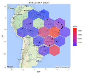
HexBin Chart of Zika Cases in Brazil

HexBin Chart of Zika Cases in Brazil

I really thought I was done with the Express dplyr series though on completion of the second part I received many messages requesting more examples of using dplyr with ggplot along with some other types of information such as the Zika virus data which can be downloaded from Github. These examples are not drastically different from previous examples although they allow me to show how each data set presents its own challenges and also how transformations to the data will be necessary to visualize  the information.  The Zika data is spread across a number of countries but we will focus uniquely on cases in Brazil. Download the data using a Git client or straight from the site itself. If you are not using Git then you are missing out. (See my Youtube playlist for a basic introduction). It’s a great way to manage your R code and larger projects. Also keep in mind that the RStudio IDE has built in Git capabilities so as you create software it is extremely easy to “push” changes to your reference code and equally as easy for users of your code to “pull” changes down.

Processing the Data

Brazil Zika DataOkay we have seven .CSV files each of which represents some Zika information on the given date. (Note that there might be more files that have been added since I wrote this post). The format of the data isn’t particularly complicated although it isn’t standard in the sense that each row in a file represents the same type of information.  In general you never really know what the data contains (or not) until you start working with it. There are a number of ways to approach this scenario. Ideally if there is a code book that explains the format then start there although it turns out that this data is simple enough to figure out. We could read in the data for a specific date, e.g. 2016-04-02.csv, but my inclination is to read in all the files and bind them together into a single data frame so I will have all that I need in one spot. This isn’t necessary but since the data itself is not very large then this is a reasonable approach.

library(dplyr)

# You will need to specify your own path to reflect your download location

path <- "/Users/fender/Downloads/zika/Brazil/Epidemiological_Bulletin/data"
setwd(path)

temp_files <- list.files(pattern=".csv")
temp_files
[1] "Epidemiological_Bulletin-2016-04-02.csv" "Epidemiological_Bulletin-2016-04-23.csv"
[3] "Epidemiological_Bulletin-2016-04-30.csv" "Epidemiological_Bulletin-2016-05-07.csv"
[5] "Epidemiological_Bulletin-2016-05-14.csv" "Epidemiological_Bulletin-2016-05-21.csv"
[7] "Epidemiological_Bulletin-2016-05-28.csv"

# Next we read all seven files the contents of each will go into a list
# element

myfiles <- lapply(temp_files,read.csv,stringsAsFactors=FALSE) 

str(myfiles,1)
List of 7
 $ :'data.frame':    33 obs. of  9 variables:
 $ :'data.frame':    33 obs. of  9 variables:
 $ :'data.frame':    33 obs. of  9 variables:
 $ :'data.frame':    33 obs. of  9 variables:
 $ :'data.frame':    33 obs. of  9 variables:
 $ :'data.frame':    33 obs. of  9 variables:
 $ :'data.frame':    33 obs. of  9 variables:

The result of the list.files() function will be a character vector that contains the names of all the .CSV files in the current working folder. We then read all of these files in using the lapply() function. We could have used a for loop construct to do the same thing although the former approach is a more “R-like” way to do things. If you don’t yet understand lapply() or need a review of what it does then please see my posting which explains it in considerable detail. It is a very cool function in R that is used many places so you definitely want to get to get to know how it works. Each element of the resulting list contains a data frame that in turn contains the contents of one of the seven .CSV files. Let’s inspect the first two lines of the first two list elements to get an idea bout the Zika data.

# First let's get the column names for the data frames

lapply(myfiles,names)[1]
[[1]]
[1] "report_date"      "location"         "location_type"    "data_field"      
[5] "data_field_code"  "time_period"      "time_period_type" "value"           
[9] "unit"      

# Now look at the first two lines of the first two list elements
lapply(myfiles,head,2)[1:2]
[[1]]
  report_date        location location_type    data_field data_field_code time_period
1  2016-04-02           Norte        region zika_reported          BR0011          NA
2  2016-04-02 Brazil-Rondonia         state zika_reported          BR0011          NA
  time_period_type value  unit
1               NA  6295 cases
2               NA   618 cases

[[2]]
  report_date    location location_type    data_field data_field_code time_period
1  2016-04-23       Norte        region zika_reported          BR0011          NA
2  2016-04-23 Brazil-Acre         state zika_reported          BR0011          NA
  time_period_type value  unit
1               NA  8545 cases
2               NA   716 cases</pre>

So we could work with each file/data frame  individually although I want to create one large data structure. The do.call() function in R is used for a number of things but is frequently used to “bind” together individual list elements  to form a single data structure so it’s going to be perfect for this job.

# The following will take all the individual list elements each of which are
# individual data frames and bind them into a single data frame

brazil <- do.call(rbind,myfiles)

# Let's turn the report_date variable into a "real" date

brazil <- brazil %>% mutate(report_date = as.Date(report_date))

glimpse(brazil)
Observations: 231
Variables: 9
$ report_date      <date> 2016-04-02, 2016-04-02, 2016-04-02, 2016-04-02, 2016-04-02,...
$ location         <chr> "Norte", "Brazil-Rondonia", "Brazil-Acre", "Brazil-Amazonas"...
$ location_type    <chr> "region", "state", "state", "state", "state", "state", "stat...
$ data_field       <chr> "zika_reported", "zika_reported", "zika_reported", "zika_rep...
$ data_field_code  <chr> "BR0011", "BR0011", "BR0011", "BR0011", "BR0011", "BR0011", ...
$ time_period      <lgl> NA, NA, NA, NA, NA, NA, NA, NA, NA, NA, NA, NA, NA, NA, NA, ...
$ time_period_type <lgl> NA, NA, NA, NA, NA, NA, NA, NA, NA, NA, NA, NA, NA, NA, NA, ...
$ value            <int> 6295, 618, 375, 1520, 44, 771, 74, 2893, 30286, 1202, 7, 156...
$ unit             <chr> "cases", "cases", "cases", "cases", "cases", "cases", "cases...
9               NA 30286 cases

If we use the glimpse() function to examine this data frame we see that we have some basic variables represented such as report_date, location, and value which appears to represent the number of cases for a given location. The location_type variable tells us whether the location is a state or region with the latter being a container of possibly many states. The way I understand the information be organized is that on a certain date a .CSV file was uploaded that contained specific locations within Brazil and the number of reported Zika cases at that time. For each subsequent date (file) the same thing happened although the new number of cases are a  “delta” or adjusted number to the previously reported number. We now have all of that in a single data frame. Let’s work with this data. We will remove columns 6 and 7 since all they have are missing values anyway as confirmed by the above glimpse() function results.

# Turn the data frame into a dplyr data table and get rid of
# columns 5 and 7

brazil <- brazil %>% select(-(6:7)) 

# Let's look at the first twenty rows. While we are at it we will
# omit columns 6 and 7 since the have all missing values anyway

brazil %>% slice (1:20) 

# A tibble: 20 x 7
   report_date                   location location_type    data_field data_field_code value  unit
        <date>                      <chr>         <chr>         <chr>           <chr> <int> <chr>
1   2016-04-02                      Norte        region zika_reported          BR0011  6295 cases
2   2016-04-02            Brazil-Rondonia         state zika_reported          BR0011   618 cases
3   2016-04-02                Brazil-Acre         state zika_reported          BR0011   375 cases
4   2016-04-02            Brazil-Amazonas         state zika_reported          BR0011  1520 cases
5   2016-04-02             Brazil-Roraima         state zika_reported          BR0011    44 cases
6   2016-04-02                Brazil-Para         state zika_reported          BR0011   771 cases
7   2016-04-02               Brazil-Amapa         state zika_reported          BR0011    74 cases
8   2016-04-02           Brazil-Tocantins         state zika_reported          BR0011  2893 cases
9   2016-04-02                   Nordeste        region zika_reported          BR0011 30286 cases
10  2016-04-02            Brazil-Maranhao         state zika_reported          BR0011  1202 cases
11  2016-04-02               Brazil-Piaui         state zika_reported          BR0011     7 cases
12  2016-04-02               Brazil-Ceara         state zika_reported          BR0011   156 cases
13  2016-04-02 Brazil-Rio_Grande_do_Norte         state zika_reported          BR0011   640 cases
14  2016-04-02             Brazil-Paraiba         state zika_reported          BR0011  1060 cases
15  2016-04-02          Brazil-Pernambuco         state zika_reported          BR0011   333 cases
16  2016-04-02             Brazil-Alagoas         state zika_reported          BR0011  1479 cases
17  2016-04-02             Brazil-Sergipe         state zika_reported          BR0011   348 cases
18  2016-04-02               Brazil-Bahia         state zika_reported          BR0011 25061 cases
19  2016-04-02                    Sudeste        region zika_reported          BR0011 35505 cases
20  2016-04-02        Brazil-Minas_Gerais         state zika_reported          BR0011  6693 cases 

Understanding the Data

This data frame, though simple, is a little confusing. For each region a cumulative number of cases is presented which represents the sum of all the constituent states occurring in some number of rows below this record. For example – the first row of the data frame summarizes reported cases for the “Norte” region on 04/02/16 and then rows 2-8 are the constituent states and their respective case number totals. So the sum of the cases of rows  2-8 is the same as the case numbers reported on row 1. And then there are other entries for the “Norte” region for different reporting dates later on in the data table.  If you look at row 19 you see that the same thing is happening for the “Sudeste” region. For someone wanting summary information this is fine but it makes the resulting data frame non-standard. As analysts you would probably want to have the region as a factor – another column in the data frame. Totals can easily be generated from this format so we lose nothing. But even with the current format we can still work with it. For example let’s pull out the totals for all regions and plot them.

# For each reporting_date we have a each of the 5 region case numbers
# So we have 7 dates/files so we have 35 rows in this table

brazil %>% filter(location_type=="region")
# A tibble: 35 x 7
   report_date     location location_type    data_field data_field_code value  unit
        <date>        <chr>         <chr>         <chr>           <chr> <int> <chr>
1   2016-04-02        Norte        region zika_reported          BR0011  6295 cases
2   2016-04-02     Nordeste        region zika_reported          BR0011 30286 cases
3   2016-04-02      Sudeste        region zika_reported          BR0011 35505 cases
4   2016-04-02          Sul        region zika_reported          BR0011  1797 cases
5   2016-04-02 Centro-Oeste        region zika_reported          BR0011 17504 cases
6   2016-04-23        Norte        region zika_reported          BR0011  8545 cases
7   2016-04-23     Nordeste        region zika_reported          BR0011 43000 cases
8   2016-04-23      Sudeste        region zika_reported          BR0011 46318 cases
9   2016-04-23          Sul        region zika_reported          BR0011  2197 cases
10  2016-04-23 Centro-Oeste        region zika_reported          BR0011 20101 cases
# ... with 25 more rows

# Let's plot it
brazil %>% filter(location_type=="region") %>% 
           ggplot(aes(x=report_date, y=value,
                        group=location, color=location)) + 
           geom_line() +  
           geom_point() +
           ggtitle("Brazil Zika Cases by Region")


Zika Line Chart

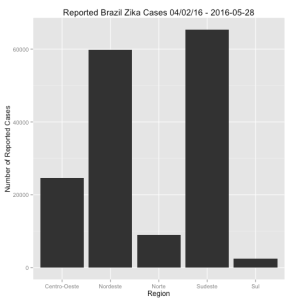
Looks like the Southeast and Northeast have the most reported cases by far and the highest increase in reported cases over the available date period. This doesn’t necessarily mean that the actual number of cases in those regions changed that much over the given date range.  It is possible that those cases were there all along and maybe the collecting and reporting mechanisms just caught up with the actual number of cases. (Note I have no idea if this is/was true or not). Let’s do a barchart of this information just for fun (and also to demonstrate an eccentricity of ggplot).

# Let's just pull out the regions into a table of its own

region <- brazil %>% filter(location_type=="region")

region %>% 
  ggplot(aes(x=location,y=value)) + geom_bar(stat="identity") +
  ylab("Number of Reported Cases") + xlab("Region") + 
  ggtitle("Reported Brazil Zika Cases 04/02/16 - 2016-05-28")

Zika Bar Chart

Dealing with Factors

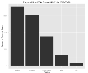
You saw something like this in the previous posting on dplyr. It’s a bar plot and it’s a bit unsatisfying since the bars are not in order according to number of cases. This data is easy to understand so it’s not a big deal although I don’t like this. I want it to be in order of most cases to least cases. To accomplish this will require creating a factor out of of the location variable based on the total number of reported cases. First here is the solution:

region %>% 
  slice(1:length(unique(region$location))) %>% 
  arrange(desc(value)) %>%
  mutate(location=factor(location,levels=location,ordered=TRUE)) %>%
  ggplot(aes(x=location,y=value)) + geom_bar(stat="identity") +
  ylab("Number of Reported Cases") + xlab("Region") + 
  ggtitle("Reported Brazil Zika Cases 04/02/16 - 2016-05-28")
Sorted Zika Cases

Sorted Zika Cases

So how does this work ? Well check this out:


# This gets us the unique locations

region %>% 
    slice(1:length(unique(region$location)))
  report_date     location location_type    data_field data_field_code value  unit
1  2016-04-02        Norte        region zika_reported          BR0011  6295 cases
2  2016-04-02     Nordeste        region zika_reported          BR0011 30286 cases
3  2016-04-02      Sudeste        region zika_reported          BR0011 35505 cases
4  2016-04-02          Sul        region zika_reported          BR0011  1797 cases
5  2016-04-02 Centro-Oeste        region zika_reported          BR0011 17504 cases

# This arranges the unique locations by number of reported cases (descending)

region %>% 
     slice(1:length(unique(region$location))) %>% 
     arrange(desc(value))
  report_date     location location_type    data_field data_field_code value  unit
1  2016-04-02      Sudeste        region zika_reported          BR0011 35505 cases
2  2016-04-02     Nordeste        region zika_reported          BR0011 30286 cases
3  2016-04-02 Centro-Oeste        region zika_reported          BR0011 17504 cases
4  2016-04-02        Norte        region zika_reported          BR0011  6295 cases
5  2016-04-02          Sul        region zika_reported          BR0011  1797 cases</pre>

# So now we can create a factor out the locations variable using this order
# Notice how location is now an ordered factor

region %>% 
     slice(1:length(unique(region$location))) %>% 
     arrange(desc(value)) %>%
     mutate(location=factor(location,levels=location,ordered=TRUE)) %>% glimpse()
Observations: 5
Variables: 7
$ report_date     <date> 2016-04-02, 2016-04-02, 2016-04-02, 2016-04-02, 2016-04-02
$ location        <ord> Sudeste, Nordeste, Centro-Oeste, Norte, Sul
$ location_type   <chr> "region", "region", "region", "region", "region"
$ data_field      <chr> "zika_reported", "zika_reported", "zika_reported", "zika_re...
$ data_field_code <chr> "BR0011", "BR0011", "BR0011", "BR0011", "BR0011"
$ value           <int> 35505, 30286, 17504, 6295, 1797
$ unit            <chr> "cases", "cases", "cases", "cases", "cases"

Standardizing the Data Format

We could continue to work with the data this way – with summaries for regions and the country sitting along side entries for states. But this mixture “violates” the standards of a “tidy” data frame. What I propose is to remove the summary info for the regions and country. We will make a factor column that gives us the region for each state. This is great because 1) all rows represent the same types of information and 2) we can easily recompute the totals for the region. There are a number of ways to do this – I’m just going with a quick method here with a loop.


# Here we will pull out these total so we can later check out work
brazil_totals <- brazil %>% filter(location=="Brazil") 
region_totals <- brazil %>% filter(location_type=="region") %>%
  group_by(report_date,location) %>%  
  summarize(tot=sum(value)) 
# Here we standardize the data frame and remove all summary rows because after all we can easily
# (re)compute any summary totals that we want

regvec <- vector()  # A vector to hold the region for a given state
length(regvec) <- nrow(brazil)
for (ii in 1:nrow(brazil)) {
  if (brazil[ii,]$location_type != "region")  {
       regvec[ii] <- newlab
  } else {
       newlab <- brazil[ii,]$location
       regvec[ii] <- newlab
  }
}

# Bind the region vector to the brazil data frame

statedf <- cbind(brazil,regvec)

# Next we eliminate the summary rows for the country and regions

statedf <- statedf %>% filter(location != "Brazil") 
statedf <- statedf %>% filter(location_type != "region") 

# Let's generate the region totals from the newly transformed data to make
# sure it matches what we had before. 
statedf %>% group_by(report_date,regvec) %>% 
            summarize(tot=sum(value)) -> totals

# Do a spot check on the totals - compare this to the original data frame 
# totals. There are differences in the column names but other than it's the
# same

all.equal(totals,region_totals)
[1] "Cols in y but not x: location. Cols in x but not y: regvec. "

# Let's take a sampling from this new data frame. Note how there is now
# a factor column that shows us what region a given state location belongs to

statedf %>% select(report_date,location,value,regvec) %>% sample_n(10)
    report_date                   location value   regvec
22   2016-04-02      Brazil-Santa_Catarina    62      Sul
174  2016-05-28             Brazil-Paraiba  2865 Nordeste
173  2016-05-28 Brazil-Rio_Grande_do_Norte  2312 Nordeste
140  2016-05-21                Brazil-Para  1583    Norte
48   2016-04-23              Brazil-Parana  1847      Sul
163  2016-05-28            Brazil-Rondonia  1032    Norte
101  2016-05-07           Brazil-Sao_Paulo  3452  Sudeste
136  2016-05-21            Brazil-Rondonia   974    Norte
67   2016-04-30          Brazil-Pernambuco   450 Nordeste
92   2016-05-07 Brazil-Rio_Grande_do_Norte  1757 Nordeste
# The following will give the same line plot as above just to show you that we
# can easily regenerate the totals with no problem.

statedf %>% group_by(report_date,regvec) %>% summarize(cases=sum(value)) %>% 
   ggplot(aes(x=report_date,y=cases,group=regvec,color=regvec)) + 
   geom_line() + 
   geom_point() + 
   ggtitle("Brazil Zika Cases by Region")

Drawing a Cluster Map

Okay what next ? Well how about generating a Leaflet Cluster Map where we see the number of cases reflected in a given region. And if we zoom in we can then see the sub clusters that make up the larger cluster. This is a cool feature of Leaflet. But to do this we will need to Geo Code the locations given in the data frame. This is easy to do since the ggmap package has  geo coding capability built into it courtesy of the geocode() function which uses Google to do the work. See how easy this:

library(ggmap)
longlat <- geocode(unique(statedf$location)) %>% 
  mutate(loc=unique(statedf$location)) 

# Let's join this geocoded information to the statedf and save it into
# another data frame for mapping

statedf %>% filter(as.character(report_date)=="2016-05-28") %>% 
  group_by(location) %>% summarize(cases=sum(value)) %>% 
  inner_join(longlat,by=c("location"="loc")) %>% 
  mutate(LatLon=paste(lat,lon,sep=":")) -> formapping

head(formapping) 
# A tibble: 6 x 5
         location cases       lon       lat              LatLon
            <chr> <int>     <dbl>     <dbl>               <chr>
1     Brazil-Acre   843 -70.00000  -9.00000              -9:-70
2  Brazil-Alagoas  3577 -36.00000  -9.00000              -9:-36
3    Brazil-Amapa   189 -52.00000   1.00000               1:-52
4 Brazil-Amazonas  2176 -63.00000  -5.00000              -5:-63
5    Brazil-Bahia 45419 -38.51083 -12.97111 -12.97111:-38.51083
6    Brazil-Ceara  2144 -38.54306  -3.71722  -3.71722:-38.54306

Cluster Map of Brazil Zika Cases

Cluster Map of Brazil Zika Cases

Wait. This doesn’t look right because we know we have many more cases in many more regions. What happened ? Well the way the cluster mapping option works is that it looks at each row and the corresponding latitude and longitude and clusters together similar rows. The data we mapped has the states listed once and their location so no wonder we get this limited output. If you look at the cases column it tells us how many times each cases occurred in that region. We need to find a hack to generate a data frame to get this number of cases for each location so the Leaflet Clustermap will look reasonable. There is a way to do this – a number of ways in fact. Here were will generate the row numbers of the data frame and for each row number we’ll replicate that row case number of times.

num_of_times_to_repeat <- formapping$cases
long_formapping <- formapping[rep(seq_len(nrow(formapping)),
                                  num_of_times_to_repeat),]

head(long_formapping)
# A tibble: 6 x 5
     location cases   lon   lat LatLon
        <chr> <int> <dbl> <dbl>  <chr>
1 Brazil-Acre   843   -70    -9 -9:-70
2 Brazil-Acre   843   -70    -9 -9:-70
3 Brazil-Acre   843   -70    -9 -9:-70
4 Brazil-Acre   843   -70    -9 -9:-70
5 Brazil-Acre   843   -70    -9 -9:-70
6 Brazil-Acre   843   -70    -9 -9:-70

# ah so this is the format we need

leaflet(long_formapping) %>% addTiles() %>% 
  addMarkers(clusterOptions=markerClusterOptions()
Accurate Cluster Map

Accurate Cluster Map

So this still isn’t ideal because if we click on one of the clusters to see the constituent sub clusters the performance can be slow especially in regions where there are lots of cases (like the Southest and Northeast).  Why don’t we make a hexbin chart that might be more useful in representing the distribution of reported Zika cases in Brazil ? Hexbin charts are an extension of the heat map concept where squares are used to capture density or count in a region. The hexagonal shape is closer to a circle shape. What we will see is that the hex shapes on the map will be colored by count of Zika cases in that area. You will need to install the hexbin package prior to use. So it might be better to use a density geometry or a chloropleth map (see comments) though in creating the long_formapping data frame you will notice that it repeats the same latitude/longitude pair many times so in effect any resulting map is basically going to represent the counts of the same locales. We could jitter the lat/lon pairs some to get a better data set for density or chloropleth. For now we will stick with the hexbin since it overlays the map nicely.

library(hexbin)
mymap <- qmap(c(lon=-56.09667,lat=-15.59611),zoom=4)
mymap + 
  geom_hex(bins=bins,data = long_formapping, aes(x = lon, y = lat),alpha=.6,
           inherit.aes=FALSE) + 
  geom_point(data = long_formapping, aes(x = lon, y=lat),
             inherit.aes=FALSE,position = "jitter")+
  scale_fill_gradient(low = "blue", high = "red")
HexBin Chart of Zika Cases in Brazil

HexBin Chart of Zika Cases in Brazil

As usual there are many other ways to kick this data round but I hope I have given you a realistic introduction to working with data that isn’t custom made for summary. Most of the data you will encounter will involve cleaning and manipulation prior to getting the best format for visualization and analysis. Speaking of analysis it can also be the case that you will need to juggle data formats around a few times to accommodate your interests. So many times you will never have a single ideal data format that will serve all your interests. This is why it is essential for you to become experienced with tools like dplyr, the lapply command, and some of the R programming constructs to glue it all together for you. Thanks for reading Steve Pittard © 2016  See my website for information on consulting and R training services.
Express dplyr Part II

Posted: July 7, 2016 in Data Mining, dplyr

This is Part II of the “Express dplyr” posting. If you haven’t already you might want to review Part I of this topic before proceeding although if you have some knowledge of dplyr then by all means proceed. Don’t worry – there are no tests ! In this second part we will work with some “real” data to help solidify our understanding of the dplyr concepts we studied previously. Note that as I wrote this posting I’ve offered up examples I put together very fast which means that there are probably opportunities for improvement and optimization. I want to present examples that can be understood by newcomers to dplyr so I’ve constructed the examples with this in mind.

The Bay Area Bike Share program allows Bay area residents to use bicycles for commuting in the area. Here is a description of the service from the website:

Users of this service can purchase an annual membership online or get a 24-hour or 3-day membership from any station kiosk. 24-hour and 3-day members will receive a ride code from the station kiosk. Enter this code on the keypad next to any available bike. Annual members can bypass the kiosk and insert their membership key at any available dock. Wait for the green light, and pull the bike out while lifting the seat. After your trip, return the bike to any station in your service area. Push the bike firmly into an available dock, and wait for the green light to confirm your trip has ended. Enjoy unlimited trips up to 30 minutes each at no additional cost! Remember, trips longer than 30 minutes will incur overtime fees. 24-hour and 3-day members must request a new ride code for each trip by swiping their credit or debit card at the kiosk

I obtained data relating to this project from the Kaggle Project page. It represents anonymized Bike Data usage from 2013-2015. The data is about 660MB and you can download it though you will need a Kaggle account. The download contains an SQLite Database which is very cool though we’ll ignore that for now and work with the CSV files. However ! I put together a TAR file that has just the .csv files which are much smaller. Go here to get it or just execute the following commands.

url <- "http://steviep42.bitbucket.org/YOUTUBE.DIR/SF.TAR"
download.file(url,"SF.TAR")system("tar -xvf SF.TAR")
system("tar -xvf SF.TAR")

library(dplyr)
library(readr)

# Read in the station data
stations <- read_csv("station.csv")  

# Read in the trip date - you might get some messages about missing zipcodes
# but don't worry if you do

trips    <- read_csv("trip.csv")

str(stations)

Classes ‘tbl_df’, ‘tbl’ and 'data.frame':	70 obs. of  7 variables:
 $ id               : int  2 3 4 5 6 7 8 9 10 11 ...
 $ name             : chr  "San Jose Diridon Caltrain Station" "San Jose Civic Center" "Santa Clara at Almaden" "Adobe on Almaden" ...
 $ lat              : num  37.3 37.3 37.3 37.3 37.3 ...
 $ long             : num  -122 -122 -122 -122 -122 ...
 $ dock_count       : int  27 15 11 19 15 15 15 15 15 19 ...
 $ city             : chr  "San Jose" "San Jose" "San Jose" "San Jose" ...
 $ installation_date: chr  "8/6/2013" "8/5/2013" "8/6/2013" "8/5/2013" ...

str(trips)

Classes ‘tbl_df’, ‘tbl’ and 'data.frame':	669959 obs. of  11 variables:
 $ id                : int  4576 4607 4130 4251 4299 4927 4500 4563 4760 4258 ...
 $ duration          : int  63 70 71 77 83 103 109 111 113 114 ...
 $ start_date        : chr  "8/29/2013 14:13" "8/29/2013 14:42" "8/29/2013 10:16" "8/29/2013 11:29" ...
 $ start_station_name: chr  "South Van Ness at Market" "San Jose City Hall" "Mountain View City Hall" "San Jose City Hall" ...
 $ start_station_id  : int  66 10 27 10 66 59 4 8 66 10 ...
 $ end_date          : chr  "8/29/2013 14:14" "8/29/2013 14:43" "8/29/2013 10:17" "8/29/2013 11:30" ...
 $ end_station_name  : chr  "South Van Ness at Market" "San Jose City Hall" "Mountain View City Hall" "San Jose City Hall" ...
 $ end_station_id    : int  66 10 27 10 67 59 5 8 66 11 ...
 $ bike_id           : int  520 661 48 26 319 527 679 687 553 107 ...
 $ subscription_type : chr  "Subscriber" "Subscriber" "Subscriber" "Subscriber" ...
 $ zip_code          : int  94127 95138 97214 95060 94103 94109 95112 95112 94103 95060 ...

With regard to the two files above a possible linking key in a join or merge of these two data frames is the id column from stations and perhaps the start_station_id and/or the end_station_id from trips. However, it might not be necessary to join the data just yet as there might be some questions that can be answered by referencing just a single table. In terms of starting to explore the data just begin thinking of some fundamental questions to get the creative juices flowing. Unless you have been given a specific assignment or set of questions there is no “right way” to do something like this. One of the biggest problems I see with students is that if you present them with an open ended opportunity for investigation they freeze up. They had much rather be given a question set and work against that but in the “real world” it isn’t really like that. Just dive in and you will be fine.

Asking Some Questions

How many bikes are there ?

Bikes have a unique identifier and are used any number of times by subscribers. The trips data table has a record of what bike was used in a given trip so we can select that column and then pipe into the distinct() function which will give us a list of all unique bike ids used. This results in a data table whose output we pipe into the nrow() function to count the number of unique bikes used.

trips %>% select(bike_id) %>% distinct()
Source: local data frame [700 x 1]

   bike_id
     (int)
1      520
2      661
3       48
4       26
5      319
6      527
7      679
8      687
9      553
10     107
..     ...

# But if we wanted a single result we could do this

trips %>% select(bike_id) %>% distinct() %>% nrow()
[1] 700

# So how many times was each bike used ? 

trips %>% group_by(bike_id) %>% summarize(times_used=n()) %>% arrange(desc(times_used))
Source: local data frame [700 x 2]

   bike_id times_used
     (int)      (int)
1      392       2061
2      489       1975
3      558       1955
4      267       1951
5      631       1948
6      518       1942
7      532       1933
8      592       1932
9      395       1927
10     368       1926
..     ...        ...

I should point out here that dplyr offers a function called count() that will do tallying/counting of data and also accomplish the group_by() and summarize() steps underneath the hood. So when determining the number of times each bike was used consider this:

trips %>% count(bike_id,sort=TRUE)
Source: local data frame [700 x 2]

   bike_id     n
     (int) (int)
1      392  2061
2      489  1975
3      558  1955
4      267  1951
5      631  1948
6      518  1942
7      532  1933
8      592  1932
9      395  1927
10     368  1926
..     ...   ...

Finding Missing Data ?

Since there were some apparent problems when reading in the trips data let’s see if we have a problem with complete cases. I suspect there are missing values in some of the zipe codes. In native R there are some functions like complete.cases() and is.na() and na.omit() that can help you figure out the “missingness” of your data. The following example also gives me an opportunity to explain how dplyr can intersect with native R commands. So we will see that the zip_code column has 17,685 missing values. Note that what I do here is pipe the trips data table into a non dplyr function.

So what columns in the trips data frame contain missing values and if so how many ?

# A pure native R solution
sapply(trips,function(x) sum(is.na(x)))
                id           duration         start_date 
                 0                  0                  0 
start_station_name   start_station_id           end_date 
                 0                  0                  0 
  end_station_name     end_station_id            bike_id 
                 0                  0                  0 
 subscription_type           zip_code 
                 0              17685 


# A dplyr equivalent

trips %>% sapply(function(x) sum(is.na(x)))
                id           duration         start_date start_station_name 
                 0                  0                  0                  0 
  start_station_id           end_date   end_station_name     end_station_id 
                 0                  0                  0                  0 
           bike_id  subscription_type           zip_code 
                 0                  0              17685 

  subscription_type zip_code
              (int)    (int)
1                 0    17685

So how many cities are covered by the service ? How many stations per city are there ?

stations %>% count(city)
Source: local data frame [5 x 2]

           city     n
          (chr) (int)
1 Mountain View     7
2     Palo Alto     5
3  Redwood City     7
4 San Francisco    35
5      San Jose    16

# We could also sort the result from highest count to lowest

 stations %>% count(city,sort=TRUE)
Source: local data frame [5 x 2]

           city     n
          (chr) (int)
1 San Francisco    35
2      San Jose    16
3 Mountain View     7
4  Redwood City     7
5     Palo Alto     5

Mapping

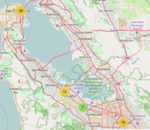
Here is something cool. We can pipe the locations of the stations to the leaflet package which provides an R interface to the popular Leaflet Javascript library. Once you install the package you can easily map all the stations. The following will produce an interactive map that from a high level will show circles containing numbers that indicate the number of stations in that area. Click on a circle to “drill down” to a more granular level to see where the stations are. If you click on the cluster circle over Palo Alto you will see it split into two clusters of 7 and 5 corresponding to the cities of Redwood City and Palo Alto respectively. The image below is just a screenshot of course but click it to enlarge the map.

library(leaflet)

m <- leaflet() %>% addTiles() %>% 
     addMarkers(lng=stations$long,lat=stations$lat,popup=stations$name,
                clusterOptions = markerClusterOptions())

m
LeafLet Cluster Map of Ride Share Stations

LeafLet Cluster Map of Ride Share Stations

Sorting Out The Dates

Note that there is a start_date and end_date for each trip. If we want to do any summary on this information it’s not a bad idea to parse them into an actual date recognized by R. The readr function comes with some date and time routines that we can use here although for more general use the lubridate package is a great package for manipulating dates and times. This can be confusing since native R provides date functions of its own. For now we will use the parse_datetime() function from the readr package.

trips %>% mutate(start_date=parse_datetime(start_date,
                                           format="%m/%d/%Y %H:%M"),
                 end_date=parse_datetime(end_date,
                                           format="%m/%d/%Y %H:%M")) -> trips

# So it looks like the data set starts on August 29, 2013 and continued to 
# August 31, 2015

range(trips$start_date)
[1] "2013-08-29 09:08:00 UTC" "2015-08-31 23:26:00 UTC"

trips
Source: local data frame [669,959 x 11]

      id duration          start_date       start_station_name start_station_id            end_date         end_station_name
   (int)    (int)              (time)                    (chr)            (int)              (time)                    (chr)
1   4576       63 2013-08-29 14:13:00 South Van Ness at Market               66 2013-08-29 14:14:00 South Van Ness at Market
2   4607       70 2013-08-29 14:42:00       San Jose City Hall               10 2013-08-29 14:43:00       San Jose City Hall
3   4130       71 2013-08-29 10:16:00  Mountain View City Hall               27 2013-08-29 10:17:00  Mountain View City Hall
4   4251       77 2013-08-29 11:29:00       San Jose City Hall               10 2013-08-29 11:30:00       San Jose City Hall
5   4299       83 2013-08-29 12:02:00 South Van Ness at Market               66 2013-08-29 12:04:00           Market at 10th
6   4927      103 2013-08-29 18:54:00      Golden Gate at Polk               59 2013-08-29 18:56:00      Golden Gate at Polk
7   4500      109 2013-08-29 13:25:00   Santa Clara at Almaden                4 2013-08-29 13:27:00         Adobe on Almaden
8   4563      111 2013-08-29 14:02:00      San Salvador at 1st                8 2013-08-29 14:04:00      San Salvador at 1st
9   4760      113 2013-08-29 17:01:00 South Van Ness at Market               66 2013-08-29 17:03:00 South Van Ness at Market
10  4258      114 2013-08-29 11:33:00       San Jose City Hall               10 2013-08-29 11:35:00              MLK Library
..   ...      ...                 ...                      ...              ...                 ...                      ...
Variables not shown: end_station_id (int), bike_id (int), subscription_type (chr), zip_code (int)

Now should we assume that all trips are started and completed on the same day ? My initial guess is that they are although that might not be true and/or there might have been an error in the data capture. Either way it’s probably wise to check. Looks like there were 2,099 trips that were started on one day and finished the next.

How many trips did not finish on the same day they began ?

trips %>% filter(substr(start_date,1,10) 
                        != substr(end_date,1,10)) %>% 
                        summarize(different_days=n())
 different_days
           (int)
1           2099

How many trips were there for each year ?

trips %>% count(substr(start_date,1,4))
Source: local data frame [3 x 2]

  substr(start_date, 1, 4)      n
                     (chr)  (int)
1                     2013 100563
2                     2014 326339
3                     2015 243057

Okay let’s extend this a little bit. We will look at the number of trips for each day of each year and use the googleVis package to create a heatmap to visualize this. We’ll need to modify the start_date to respect only the year and ignore the hour and minute portion. The way we did this above was by using the substr() function. However, the googleVis package expects an actual date as opposed to a character string (which is what gets returned by substr() so we’ll need to work a little bit harder (but not too much). So we use the as.Date() to truncate the full date string into just the Year, Month, and Day. We’ll then filter out just the trips that began and ended on the same day, then group by start date, and then count the number of trips for each day. Remember – we are NOT changing the underlying trips date frame at all – we just use the pipe operator to mutate, filter, group, and summarize the data in a single command chain. There is no need to store temporary or intermediate results into a data frame unless you want to.

library(googleVis)

trips %>% mutate(start_date=as.Date(start_date), 
                 end_date=as.Date(end_date)) %>%
                 filter(start_date == end_date) %>% 
                 count(start_date) -> tripdates

# Create a Gvisplot and then plot it

plot( 
  gvisCalendar(data=tripdates, datevar="start_date", numvar="n",
               options=list(
                 title="Calendar Heat Map of Open Bike Trips",
                 calendar="{cellSize:10,
                 yearLabel:{fontSize:20, color:'#444444'},
                 focusedCellColor:{stroke:'red'}}",
                 width=590, height=320),
               chartid="Calendar")
)

Trips per Day of Year

Trips per Day of Year

Trips by Day of the Week

One of the advantages of turning the start and end dates into actual date objects is because we can then use built in R date functions. For example how many trips were there for each day of the week ? We can leverage the strength of the weekdays() function to figure this out.

trips %>% mutate(weekdays = weekdays(start_date)) %>% 
         count(weekdays, sort=TRUE)
Source: local data frame [7 x 2]

   weekdays      n
      (chr)  (int)
1   Tuesday 122259
2 Wednesday 120201
3  Thursday 119089
4    Monday 115873
5    Friday 109361
6  Saturday  44785
7    Sunday  38391

# But let's plot this

trips %>% mutate(weekdays = weekdays(start_date)) %>% 
  count(weekdays, sort=TRUE) %>%
   ggplot(aes(x=weekdays,y=n)) + 
   geom_bar(stat="identity") + 
   ggtitle("Trips per Day of The Week") +
   ylab("Total Trips")

Total Trips per Day of Week

Joins

Up until now we have been working with a single table and summaries thereof. Next let’s use our knowledge of joins and merging to learn more about the data. For example, what are the most popular bike stations ? How would we answer this question ? Well we have a list of all the trips in the trips data frame which includes the beginning and ending station id for each trip. So, for each station, is there a way to find the number of trips starting or ending there ? If so then we can find the stations with the highest number of starts and stops which will then tell us the most popular stations.

# For each station we count the number of trips initiated from the 
# station or ended there. 

# Here we get the number of times a trip started at a station

trips %>% count(start_station_id) -> start

Source: local data frame [70 x 2]

   start_station_id     n
              (int) (int)
1                 2  9558
2                 3  1594
3                 4  3861
4                 5  1257
5                 6  2917
6                 7  2233
7                 8  1692
8                 9  1910
9                10  2393
10               11  2034
..              ...   ...

# Here we get the number of times a trip ended at a station

trips %>% count(end_station_id) -> end

Source: local data frame [70 x 2]

   end_station_id     n
            (int) (int)
1               2  9415
2               3  1786
3               4  3705
4               5  1169
5               6  3163
6               7  2498
7               8  1707
8               9  2200
9              10  1658
10             11  2508
..            ...   ...

# Let's join these two tables using the station_ids as keys. While we do
# the join we can add together the start and end counts for each 
# station. This tells us how "popular" a given station was

inner_join(start,end,by=c("start_station_id"="end_station_id")) %>% 
    mutate(total_trips=n.x+n.y) %>% 
    arrange(desc(total_trips))

Source: local data frame [70 x 4]

   start_station_id cnt.x cnt.y total_trips
              (int) (int) (int)       (int)
1                70 49092 63179      112271
2                69 33742 35117       68859
3                50 32934 33193       66127
4                60 27713 30796       58509
5                61 25837 28529       54366
6                77 24172 28033       52205
7                65 23724 26637       50361
8                74 24838 25025       49863
9                55 26089 23080       49169
10               76 20165 19915       40080
..              ...   ...   ...         ...

# Okay now let's join this with the stations data frame to get some
# more information such as the latitude and longitude

inner_join(start,end,by=c("start_station_id"="end_station_id")) %>% 
     mutate(total=n.x+n.y) %>% 
     arrange(desc(total)) %>%
     inner_join(stations,c("start_station_id"="id")) %>% 
     select(c(1,4:7,9)) 

Source: local data frame [70 x 6]

   start_station_id total                                          name      lat
              (int)       (int)                                         (chr)    (dbl)
1                70      112271      San Francisco Caltrain (Townsend at 4th) 37.77662
2                69       68859       San Francisco Caltrain 2 (330 Townsend) 37.77660
3                50       66127          Harry Bridges Plaza (Ferry Building) 37.79539
4                60       58509                        Embarcadero at Sansome 37.80477
5                61       54366                               2nd at Townsend 37.78053
6                77       52205                             Market at Sansome 37.78963
7                65       50361                               Townsend at 7th 37.77106
8                74       49863                             Steuart at Market 37.79414
9                55       49169 Temporary Transbay Terminal (Howard at Beale) 37.78976
10               76       40080                                 Market at 4th 37.78630
..              ...         ...                                           ...      ...
Variables not shown: long (dbl), city (chr)

More Mapping

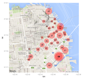
Wouldn’t it be nice to plot this information on a map ? We could plot points representing the station locations and maybe even make the size of a given point/location to be in proportion to the number of trips starting and ending with that given station. This would make it really easy to see which stations get a lot of traffic. To do this we know we are going to need the latitude and longitude information from the stations data frame (but we already have that courtesy of the commands above). Also for purposes of this exercise let’s just focus only on San Francisco bike stations. That is we won’t worry about Palo Alto, Redwood City, Mountain View, or San Jose. Let’s start by reissuing the last command and doing some more selecting to get the right information.

inner_join(start,end,by=c("start_station_id"="end_station_id")) %>% 
     mutate(total=n.x+n.y) %>% 
     arrange(desc(total)) %>%
     inner_join(stations,c("start_station_id"="id")) %>% 
     select(c(1,4:7,9)) %>% filter(city=="San Francisco") -> sfstats

Source: local data frame [35 x 6]

   start_station_id total                                          name      lat      long          city
              (int)       (int)                                         (chr)    (dbl)     (dbl)         (chr)
1                70      112271      San Francisco Caltrain (Townsend at 4th) 37.77662 -122.3953 San Francisco
2                69       68859       San Francisco Caltrain 2 (330 Townsend) 37.77660 -122.3955 San Francisco
3                50       66127          Harry Bridges Plaza (Ferry Building) 37.79539 -122.3942 San Francisco
4                60       58509                        Embarcadero at Sansome 37.80477 -122.4032 San Francisco
5                61       54366                               2nd at Townsend 37.78053 -122.3903 San Francisco
6                77       52205                             Market at Sansome 37.78963 -122.4008 San Francisco
7                65       50361                               Townsend at 7th 37.77106 -122.4027 San Francisco
8                74       49863                             Steuart at Market 37.79414 -122.3944 San Francisco
9                55       49169 Temporary Transbay Terminal (Howard at Beale) 37.78976 -122.3946 San Francisco
10               76       40080                                 Market at 4th 37.78630 -122.4050 San Francisco
..              ...         ...                                           ...      ...       ...           ...

# Next I scale the total number of trips variable down to a reasonable number
# for use with the geom_point function. You could come up with your own 
# scaling function to do this. The idea is that when we plot each station
# on the map we can adjust the size of the respective point to reflect how
# busy that station is. There are other ways to do this of course

sz <- round((sfstats$total)^(1/3)-20)

qmap(c(lon=-122.4071,lat=37.78836),zoom=14) -> mymap

mymap + 
  geom_point(data=sfstats, aes(x=long,y=lat),
             color="red", alpha=0.4,size=sz) + 
             geom_text(data=sfstats,
                       aes(x=long,y=lat,label=start_station_id),size=4)


Plot of SF Stations by Popularity

Plot of SF Stations by Popularity

Two things to note here: 1) the numbers in the circles are the station ids of the associated station. We could have put up the actual station names but that would look messy. 2) There is some over plotting in the lower part of the map because there are two Cal Train related stations very close to each other both of which experience lots of use. So the ids are stacked on top of each other at the current map resolution. We could easily fix this by changing the resolution or plotting these points separately (left as an exercise for the reader).

       San Francisco Caltrain (Townsend at 4th)       49092
        San Francisco Caltrain 2 (330 Townsend)       33742

The “trick” with the sz vector is to find a way to scale the total_trips column in the sfstats data table in a way that let’s us use this figure to specify the size of the point. Here I took the cube root of the total count and subtracted an arbitrary number. I experimented with this but generally find that using root functions can be useful when scaling count data.

What Next ?

We’ve just scratched the surface here. What about identifying the most frequently used trip segments ? We could identify all trip pairs (starting station and ending station id) and count the number of times each occurs. We could then perhaps draw segments on the map to more easily visualize these popular segments. . In a different direction there is another CSV file that came with the data called weather.csv that has meteorological information for each day of the year. We could investigate the impact that weather has on bike usage. Lastly, the data set on Kaggle comes with an SQLite database which we could also use in a couple of ways. dplyr has the ability to connect to SQLite databases though we could also use the RSQLite connection package to execute SQL queries against the database. I’ll explore these options in a future posting. Thanks, Steve Pittard

Express Intro to dplyr

Posted: June 29, 2016 in Data Mining
Tags: ,

Working The Data Like a Boss !

I recently introduced the data.table package which provides a nice way to manage and aggregate large data sources using the standard bracket notation that is commonly employed when manipulating data frames in R. As data sources grow larger one must be prepared with a variety of approaches to efficiently handle this information. Using databases (both SQL and NoSQL) are a possibility wherein one queries for a subset of information although this assumes that the database is pre-existing or that you are prepared to create it yourself. The dplyr package offers ways to read in large files, interact with databases, and accomplish aggregation and summary. Some feel that dplyr is a competitor to the data.table package though I do not share that view. I think that each offers a well-conceived philosophy and approach and does a good job of delivering on their respective design goals. That there is overlap in their potential applications simply means to me that there is another way to do something. They are just great tools in a larger toolbox so I have no complaints. Let’s dig into dplyr to learn what it can do. Note that this post is part one of two. The second dplyr blog will apply the knowledge learned in this post.

Upcoming Class

Before we get too deep into this I wanted to indicate that I will be teaching a 3-day Intro to R BootCamp in the Atlanta, GA area of the US sometime in August or September. I say “sometime” because the logistics are still under development. If interested please feel free to email me and once I get everything lined up I will get back to you with the details. You can also visit my home page. Thanks for indulging my self-promotion. Steve – Now Back to the Action…

Verbs in Action !

dplyr is based on the idea that when working with data there are a number of common activities one will pursue: reading, filtering rows on some condition, selecting or excluding columns, arranging/sorting, grouping, summarize, merging/joining, and mutating/transforming columns. There are other activities but these describe the main categories. dplyr presents a number of commands or “verbs” that help you accomplish the work. Note that dplyr does not replace any existing commands – it simply gives you new commands:

Command Purpose
select() Select columns from a data frame
filter() Filter rows according to some condition(s)
arrange() Sort / Re-order rows in a data frame
mutate() Create new columns or transform existing ones
group_by() Group a data frame by some factor(s) usually in conjunction to summary
summarize() Summarize some values from the data frame or across groups
inner_join(x,y,by=”col”) return all rows from ‘x’ where there are matching values in ‘x’, and all columns from ‘x’ and ‘y’. If there are multiple matches between ‘x’ and ‘y’, all combination of the matches are returned.
left_join(x,y,by=”col”) return all rows from ‘x’, and all columns from ‘x’ and ‘y’. Rows in ‘x’ with no match in ‘y’ will have ‘NA’ values in the new columns. If there are multiple matches between ‘x’ and ‘y’, all combinations of the matches are returned.
right_join(x,y,by=”col”) return all rows from ‘y’, and all columns from ‘x’ and y. Rows in ‘y’ with no match in ‘x’ will have ‘NA’ values in the new columns. If there are multiple matches between ‘x’ and ‘y’, all combinations of the matches are returned
anti_join(x,y,by=”col”) return all rows from ‘x’ where there are not matching values in ‘y’, keeping just columns from ‘x’


readr

There is also an associated package called readr that is more efficient at ingesting CSV files than the base R functions such as read.csv. While it is not part of the actual dplyr package it does in fact produce a dplyr structure as it reads in files. readr provides the read_csv function to do the work. It is also pretty smart and can figure things out like if there is a header or not so you don’t have to provide a lot of additional arguments. Here is an example using a file that contains information on weather station measurements in the year 2013.

install.packages("readr")  # one time only 
library(readr)

url <- "http://steviep42.bitbucket.org/YOUTUBE.DIR/weather.csv"
download.file(url,"weather.csv")

system("head -5 weather.csv")  # Take a peak at the first 5 lines

"origin","year","month","day","hour","temp","dewp","humid","wind_dir","wind_speed","wind_gust","precip","pressure","visib"
"EWR",2013,1,1,0,37.04,21.92,53.97,230,10.35702,11.9186514756,0,1013.9,10
"EWR",2013,1,1,1,37.04,21.92,53.97,230,13.80936,15.8915353008,0,1013,10
"EWR",2013,1,1,2,37.94,21.92,52.09,230,12.65858,14.5672406924,0,1012.6,10
"EWR",2013,1,1,3,37.94,23,54.51,230,13.80936,15.8915353008,0,1012.7,10

weather <- read_csv("weather.csv")

weather
Source: local data frame [8,719 x 14]

   origin  year month   day  hour  temp  dewp humid wind_dir wind_speed
    (chr) (int) (int) (int) (int) (dbl) (dbl) (dbl)    (int)      (dbl)
1     EWR  2013     1     1     0 37.04 21.92 53.97      230   10.35702
2     EWR  2013     1     1     1 37.04 21.92 53.97      230   13.80936
3     EWR  2013     1     1     2 37.94 21.92 52.09      230   12.65858
4     EWR  2013     1     1     3 37.94 23.00 54.51      230   13.80936
5     EWR  2013     1     1     4 37.94 24.08 57.04      240   14.96014
6     EWR  2013     1     1     6 39.02 26.06 59.37      270   10.35702
7     EWR  2013     1     1     7 39.02 26.96 61.63      250    8.05546
8     EWR  2013     1     1     8 39.02 28.04 64.43      240   11.50780
9     EWR  2013     1     1     9 39.92 28.04 62.21      250   12.65858
10    EWR  2013     1     1    10 39.02 28.04 64.43      260   12.65858
..    ...   ...   ...   ...   ...   ...   ...   ...      ...        ...
Variables not shown: wind_gust (dbl), precip (dbl), pressure (dbl), visib (dbl)

tbl_df

It is important to note that dplyr works transparently with existing R data frames though ideally one should explicitly create or transform an existing data frame to a dplyr structure to get the full benefit of the package. Let’s use the dplyr tbl_df command to wrap an existing data frame. We’ll convert the infamous mtcars data frame into a dplyr table since it is a small data frame that is easy to understand. The main advantage in using a ‘tbl_df’ over a regular data frame is the printing: tbl objects only print a few rows and all the columns that fit on one screen, describing the rest of it as text.

dp_mtcars <- tbl_df(mtcars)

# dp_mtcars is a data frame as well as a dplyr object

class(dp_mtcars)
[1] "tbl_df"     "tbl"        "data.frame"

In the example below (as with the readr example above) notice how only a subset of the data gets printed by default. This is actually very nice especially if you have ever accidentally typed the name of a really, really large native data frame. R will dutifully try to print a large portion of the data even if it locks up your R session. So wrapping the data frame in a dplyr table will prevent this. Also notice how you get a summary of the number of rows and columns as well as the type of each column.

dp_mtcars
Source: local data frame [32 x 11]

     mpg   cyl  disp    hp  drat    wt  qsec    vs    am  gear  carb
   (dbl) (dbl) (dbl) (dbl) (dbl) (dbl) (dbl) (dbl) (dbl) (dbl) (dbl)
1   21.0     6 160.0   110  3.90 2.620 16.46     0     1     4     4
2   21.0     6 160.0   110  3.90 2.875 17.02     0     1     4     4
3   22.8     4 108.0    93  3.85 2.320 18.61     1     1     4     1
4   21.4     6 258.0   110  3.08 3.215 19.44     1     0     3     1
5   18.7     8 360.0   175  3.15 3.440 17.02     0     0     3     2
6   18.1     6 225.0   105  2.76 3.460 20.22     1     0     3     1
7   14.3     8 360.0   245  3.21 3.570 15.84     0     0     3     4
8   24.4     4 146.7    62  3.69 3.190 20.00     1     0     4     2
9   22.8     4 140.8    95  3.92 3.150 22.90     1     0     4     2
10  19.2     6 167.6   123  3.92 3.440 18.30     1     0     4     4
..

Now we could start to operate on this data frame / dplyr table by using some of the commands on offer from dplyr. They do pretty much what the name implies and you could use them in isolation though the power of dplyr comes through when using the piping operator to chain together commands. We’ll get there soon enough. Here are some basic examples:

filter()


# Find all rows where MPG is >= 30 and Weight is over 1.8 tons

filter(dp_mtcars, mpg >= 30 & wt > 1.8)
Source: local data frame [2 x 11]

    mpg   cyl  disp    hp  drat    wt  qsec    vs    am  gear  carb
  (dbl) (dbl) (dbl) (dbl) (dbl) (dbl) (dbl) (dbl) (dbl) (dbl) (dbl)
1  32.4     4  78.7    66  4.08 2.200 19.47     1     1     4     1
2  33.9     4  71.1    65  4.22 1.835 19.90     1     1     4     1

select()

The following example illustrates how the select() function works. We will select all columns whose name begins with the letter “m”. This is more useful when you have lots of columns that are named according to some pattern. For example some Public Health data sets can have many, many columns (hundreds even) so counting columns becomes impractical which is why select() supports a form of regular expressions to find columns by name. Other helpful arguments in this category include:

Argument Purpose
ends_with(x, ignore.case=TRUE) Finds columns whose nqme ends with “x”
contains(x, ignore.case=TRUE) Finds columns whose nqme contains “x”
matches(x, ignore.case=TRUE) Finds columns whose names match the regular expression “x”
num_range(“x”,1:5, width=2) selects all variables (numerically) from x01 to x05
one_of(“x”, “y”, “z”) Selects variables provided in a character vector
select(dp_mtcars,starts_with("m"))
Source: local data frame [32 x 1]

     mpg
   (dbl)
1   21.0
2   21.0
3   22.8
4   21.4
5   18.7
6   18.1
7   14.3
8   24.4
9   22.8
10  19.2

# Get all columns except columns 5 through 10 

select(dp_mtcars,-(5:10))
Source: local data frame [32 x 5]

     mpg   cyl  disp    hp  carb
   (dbl) (dbl) (dbl) (dbl) (dbl)
1   21.0     6 160.0   110     4
2   21.0     6 160.0   110     4
3   22.8     4 108.0    93     1
4   21.4     6 258.0   110     1
5   18.7     8 360.0   175     2
6   18.1     6 225.0   105     1
7   14.3     8 360.0   245     4
8   24.4     4 146.7    62     2
9   22.8     4 140.8    95     2
10  19.2     6 167.6   123     4
..   ...   ...   ...   ...   ...

mutate()

Here we use the mutate() function to transform the wt variable by multiplying it by 1,000 and then we create a new variable called “good_mpg” which takes on a value of “good” or “bad” depending on if a given row’s MPG value is > 25 or not

mutate(dp_mtcars, wt=wt*1000, good_mpg=ifelse(mpg > 25,"good","bad"))
Source: local data frame [32 x 12]

     mpg   cyl  disp    hp  drat    wt  qsec    vs    am  gear  carb good_mpg
   (dbl) (dbl) (dbl) (dbl) (dbl) (dbl) (dbl) (dbl) (dbl) (dbl) (dbl)    (chr)
1   21.0     6 160.0   110  3.90  2620 16.46     0     1     4     4      bad
2   21.0     6 160.0   110  3.90  2875 17.02     0     1     4     4      bad
3   22.8     4 108.0    93  3.85  2320 18.61     1     1     4     1      bad
4   21.4     6 258.0   110  3.08  3215 19.44     1     0     3     1      bad
5   18.7     8 360.0   175  3.15  3440 17.02     0     0     3     2      bad
6   18.1     6 225.0   105  2.76  3460 20.22     1     0     3     1      bad
7   14.3     8 360.0   245  3.21  3570 15.84     0     0     3     4      bad
8   24.4     4 146.7    62  3.69  3190 20.00     1     0     4     2      bad
9   22.8     4 140.8    95  3.92  3150 22.90     1     0     4     2      bad
10  19.2     6 167.6   123  3.92  3440 18.30     1     0     4     4      bad
..   ...   ...   ...   ...   ...   ...   ...   ...   ...   ...   ...      ...

arrange()

Next we could sort or arrange the data according to some column values. This is usually to make visual inspection of the data easier. Let’s sort the data frame by cars with the worst MPG and then sort by weight from heaviest to lightest.

arrange(dp_mtcars,mpg,desc(wt))
Source: local data frame [32 x 11]

     mpg   cyl  disp    hp  drat    wt  qsec    vs    am  gear  carb
   (dbl) (dbl) (dbl) (dbl) (dbl) (dbl) (dbl) (dbl) (dbl) (dbl) (dbl)
1   10.4     8 460.0   215  3.00 5.424 17.82     0     0     3     4
2   10.4     8 472.0   205  2.93 5.250 17.98     0     0     3     4
3   13.3     8 350.0   245  3.73 3.840 15.41     0     0     3     4
4   14.3     8 360.0   245  3.21 3.570 15.84     0     0     3     4
5   14.7     8 440.0   230  3.23 5.345 17.42     0     0     3     4
6   15.0     8 301.0   335  3.54 3.570 14.60     0     1     5     8
7   15.2     8 275.8   180  3.07 3.780 18.00     0     0     3     3
8   15.2     8 304.0   150  3.15 3.435 17.30     0     0     3     2
9   15.5     8 318.0   150  2.76 3.520 16.87     0     0     3     2
10  15.8     8 351.0   264  4.22 3.170 14.50     0     1     5     4
..   ...   ...   ...   ...   ...   ...   ...   ...   ...   ...   ...

Ceci n’est pas une pipe

While the above examples are instructive they are not, at least in my opinion, the way to best use dplyr. Once you get up to speed with dplyr functions I think you will soon agree that using “pipes” to create chains of commands is the way to go. If you come from a UNIX background you will no doubt have heard of “pipes” which is a construct allowing you to take the output of one command and route it or “pipe” it to the input of another program. This can be done for several commands thus creating a chain of piped commands. One can save typing while creating, in effect, a “one line program” that does a lot. Here is an example of a UNIX pipeline. I’m using Apple OSX but this should work on a Linux machine just as well. This example will pipe the output of the /etc/passwd file into the input of the awk command (a program used to parse files) and the output of the awk command will go into the input of the tail command which lists the last 10 lines of the final result.

 $ cat /etc/passwd | awk -F: '{print $1}' | tail
_krb_krbtgt
_krb_kadmin
_krb_changepw
_krb_kerberos
_krb_anonymous
_assetcache
_coremediaiod
_xcsbuildagent
_xcscredserver
_launchservicesd

$ 

This is a great paradigm for working on UNIX that also maps well for what one does in data exploration. When first encountering data you rarely know what it is you want to get from it (unless you are a student and your teacher told you specifically what she or he wants). So you embark on some exploratory work and start to interrogate the data which might first require some filtering and maybe exclusion of incomplete data or maybe some imputation for missing values. Until you have worked with it for a while you don’t want to change the data – you just want to experiment with various transformed and grouped versions of it which is much easier if you use dplyr. Just pipe various commands together to clean up your data, make some visualizations, and perhaps generate some hypotheses about your data. You find yourself generating some pretty involved adhoc command chains without having to create a standalone script file. The dplyr package uses the magrittr package to enable this piping capability within R. The “pipe” character is “%>%” which is different from the traditional UNIX pipe which is the vertical bar “|”. But don’t let the visual difference confuse you as, conceptually, pipes in R work just like they do in UNIX. The magrittr package has a motto “Ceci n’est pas une pipe” presumably in acknowledgement of the noted difference and also as a tribute to the painter Rene Magritte’s work La trahison des images.


# Here we filter rows where MPG is >= 25 and then select only rows 1-4
# and 10-11.

dp_mtcars %>% filter(mpg >= 25) %>% select(-c(5:9)) 
Source: local data frame [6 x 6]

    mpg   cyl  disp    hp  gear  carb
  (dbl) (dbl) (dbl) (dbl) (dbl) (dbl)
1  32.4     4  78.7    66     4     1
2  30.4     4  75.7    52     4     2
3  33.9     4  71.1    65     4     1
4  27.3     4  79.0    66     4     1
5  26.0     4 120.3    91     5     2
6  30.4     4  95.1   113     5     2

Next we filter rows where MPG is >= 25 and then select only rows 1-4 and 10-11 after which we sort the result by MPG from highest to lowest. You can keep adding as many pipes as you wish. At first, while you are becoming familiar with the idea, it is best to keep the pipeline relatively short so you can check your work. But it will not be long before you are stringing together lots of different commands. dplyr enables and encourages this type of activity so don’t be shy.

dp_mtcars %>% filter(mpg >= 25) %>% select(-c(5:9)) %>% arrange(desc(mpg))
Source: local data frame [6 x 6]

    mpg   cyl  disp    hp  gear  carb
  (dbl) (dbl) (dbl) (dbl) (dbl) (dbl)
1  33.9     4  71.1    65     4     1
2  32.4     4  78.7    66     4     1
3  30.4     4  75.7    52     4     2
4  30.4     4  95.1   113     5     2
5  27.3     4  79.0    66     4     1
6  26.0     4 120.3    91     5     2

That was pretty cool wasn’t it ? We don’t need to alter dp_mtcars at all to explore it. We could change our minds about how and if we want to filter, select, or sort. The way this works is that the output of the dp_mtcars data frame/table gets sent to the input of the filter function that is aware of the source which is why we don’t need to explicitly reference dp_mtcars by name. The output of the filter step gets sent to the select function which in turns pipes or chains its output into the input of the arrange function which sends its output to the screen. We could even pipe the output of these operations to the ggplot2 package. But first let’s convert some of the columns into factors so the resulting plot will look better.

# Turn the cyl and am variables into factors. Notice that the resulting
# output reflects the change

dp_mtcars %>%
mutate(cyl=factor(cyl,levels=c(4,6,8)),
am=factor(am,labels=c("Auto","Manual" )))
mpg    cyl  disp    hp  drat    wt  qsec    vs     am  gear  carb
(dbl) (fctr) (dbl) (dbl) (dbl) (dbl) (dbl) (dbl) (fctr) (dbl) (dbl)
1   21.0      6 160.0   110  3.90 2.620 16.46     0 Manual     4     4
2   21.0      6 160.0   110  3.90 2.875 17.02     0 Manual     4     4
3   22.8      4 108.0    93  3.85 2.320 18.61     1 Manual     4     1
4   21.4      6 258.0   110  3.08 3.215 19.44     1   Auto     3     1
5   18.7      8 360.0   175  3.15 3.440 17.02     0   Auto     3     2
6   18.1      6 225.0   105  2.76 3.460 20.22     1   Auto     3     1
7   14.3      8 360.0   245  3.21 3.570 15.84     0   Auto     3     4
8   24.4      4 146.7    62  3.69 3.190 20.00     1   Auto     4     2
9   22.8      4 140.8    95  3.92 3.150 22.90     1   Auto     4     2
10  19.2      6 167.6   123  3.92 3.440 18.30     1   Auto     4     4
..   ...    ...   ...   ...   ...   ...   ...   ...    ...   ...   ...

But that was kind of boring – Let’s visualize this using the ggplot package whose author, Hadley Wickham, is also the author of dplyr.

dp_mtcars %>% mutate(cyl=factor(cyl,levels=c(4,6,8)),
                     am=factor(am,labels=c("Auto","Manual" ))) %>%
                     ggplot(aes(x=wt,y=mpg,color=cyl)) +
                     geom_point() + facet_wrap(~am)

ggplot_out

Okay well that might have been too much for you and that’s okay if it is. Let’s break this down into two steps. First let’s save the results of the mutate operation into a new data frame.

new_dp_mtcars <- dp_mtcars %>% mutate(cyl=factor(cyl,levels=c(4,6,8)),
                     am=factor(am,labels=c("Auto","Manual" )))

# Now we can call the ggplot command separately

ggplot(new_dp_mtcars,aes(x=wt,y=mpg,color=cyl)) +
                     geom_point() + facet_wrap(~am)

Pick whatever approach you want to break things down to the level you need. However, I guarantee that after a while you will probably wind up writing lots of one line programs.

Split-Apply-Combine

There are two more commands from the dplyr package that are particularly useful in aggregating data. The group_by() and summarize() functions help us group a data frame according to some factors and then apply some summary functions across those groups. The idea is to first “split” the data into groups, “apply” some functions (e.g. mean()) to some continuous quantity relating to each group, and then combine those group specific results back into an integrated result. In the next example we will group (or split) the data frame by the cylinder variable and then summarize the mean MPG for each group and then combine that into a final aggregated result.

dp_mtcars %>% group_by(cyl) %>% summarize(avg_mpg=mean(mpg))
Source: local data frame [3 x 2]

    cyl  avg_mpg
  (dbl)    (dbl)
1     4 26.66364
2     6 19.74286
3     8 15.10000

# Let's group by cylinder then by transmission type and then apply the mean
# and sd functions to mpg

dp_mtcars %>% group_by(cyl,am) %>% summarize(avg_mpg=mean(mpg),sd=sd(mpg))
Source: local data frame [6 x 4]
Groups: cyl [?]

    cyl    am  avg_mpg        sd
  (dbl) (dbl)    (dbl)     (dbl)
1     4     0 22.90000 1.4525839
2     4     1 28.07500 4.4838599
3     6     0 19.12500 1.6317169
4     6     1 20.56667 0.7505553
5     8     0 15.05000 2.7743959
6     8     1 15.40000 0.5656854

# Note that just grouping a data frame without summary doesn't appear to do 
# much from a visual point of view. 

dp_mtcars %>% group_by(cyl)
Source: local data frame [32 x 11]
Groups: cyl [3]

     mpg   cyl  disp    hp  drat    wt  qsec    vs    am  gear  carb
   (dbl) (dbl) (dbl) (dbl) (dbl) (dbl) (dbl) (dbl) (dbl) (dbl) (dbl)
1   21.0     6 160.0   110  3.90 2.620 16.46     0     1     4     4
2   21.0     6 160.0   110  3.90 2.875 17.02     0     1     4     4
3   22.8     4 108.0    93  3.85 2.320 18.61     1     1     4     1
4   21.4     6 258.0   110  3.08 3.215 19.44     1     0     3     1
5   18.7     8 360.0   175  3.15 3.440 17.02     0     0     3     2
6   18.1     6 225.0   105  2.76 3.460 20.22     1     0     3     1
7   14.3     8 360.0   245  3.21 3.570 15.84     0     0     3     4
8   24.4     4 146.7    62  3.69 3.190 20.00     1     0     4     2
9   22.8     4 140.8    95  3.92 3.150 22.90     1     0     4     2
10  19.2     6 167.6   123  3.92 3.440 18.30     1     0     4     4
..   ...   ...   ...   ...   ...   ...   ...   ...   ...   ...   ...

Merging Data Frames

One of the strengths of dplyr is it’s ability to do merges via various “joins” like those associated with database joins. There is already a built-in R command called merge that can handle merging duties but dplyr offers flexible and extended capabilities in this regard. Moreover it does so in a way that is consistent (for the most part) with SQL which you can use for a wide variety of data mining tasks. If you already know SQL then you will understand these commands without much effort. Let’s set up two example simple data frames to explain the concept of joining.

df1 <- data.frame(id=c(1,2,3),m1=c(0.98,0.45,0.22))
df2 <- data.frame(id=c(3,4),m1=c(0.17,0.66))

df1
  id   m1
1  1 0.98
2  2 0.45
3  3 0.22

df2
  id   m1
1  3 0.17
2  4 0.66

Left Join

Think about what it means to merge these data frames. It makes sense to want to join the data frames with respect to some common column name. In this case it is clear that the id column is in both data frames. So let’s join the data frames using “id” as a “key”. The question is what to do about the fact that there is no id in df2 corresponding to id number 2. This is why different types of joins exist. Let’s see how they work. We’ll start with the left join:

left_join(df1,df2,by="id")
  id m1.x m1.y
1  1 0.98   NA
2  2 0.45   NA
3  3 0.22 0.17

So the left join looks at the first data frame df1 and then attempts to find corresponding “id” values in df2 that match all id values in df1. Of course there are no ids matching 2 or 3 in df2 so what happens ? The left join will insert NAs in the m1.y column since there are no values in df2. Note that there is in fact an id of value 3 in both data frames so it fills in both measurement columns with the values. Also note that since in both data frames there is a column named “m1” so it has to create unique names to accommodate both columns. The “x” and “y” come from the fact that df1 comes before df2 in the calling sequence to left_join. Thus “x” matches df1 and “y” matches df2.

Inner Join

Let’s join the two data frames in a way that yields only the intersection of the two data structures based on “id”. Using visual examination we can see that there is only one id in common to both data frames – id 3.

inner_join(df1,df2,by="id")
  id m1.x m1.y
1  3 0.22 0.17

More Involved Join Examples

Now we’ll look at a more advanced example. Let’s create two data frames where the first, (we’ll call it “authors”), presents a list of, well, authors. The second data frame presents a list of books published by various authors. Each data frame has some additional attributes of interest.

# For reference sake - these data frames come from the examples contained in 
# the help pages for the built-in R merge command

authors <- data.frame(
         surname = I(c("Tukey", "Venables", "Tierney", "Ripley", "McNeil")),
         nationality = c("US", "Australia", "US", "UK", "Australia"),
         deceased = c("yes", rep("no", 4)))
     
books <- data.frame(
         name = I(c("Tukey", "Venables", "Tierney",
                  "Ripley", "Ripley", "McNeil", "R Core")),
         title = c("Exploratory Data Analysis",
                   "Modern Applied Statistics ...",
                   "LISP-STAT",
                   "Spatial Statistics", "Stochastic Simulation",
                   "Interactive Data Analysis",
                   "An Introduction to R"),
         other.author = c(NA, "Ripley", NA, NA, NA, NA,
                          "Venables & Smith"))

authors
   surname nationality deceased
1    Tukey          US      yes
2 Venables   Australia       no
3  Tierney          US       no
4   Ripley          UK       no
5   McNeil   Australia       no
 
books
      name                         title     other.author
1    Tukey     Exploratory Data Analysis             <NA>
2 Venables Modern Applied Statistics ...           Ripley
3  Tierney                     LISP-STAT             <NA>
4   Ripley            Spatial Statistics             <NA>
5   Ripley         Stochastic Simulation             <NA>
6   McNeil     Interactive Data Analysis             <NA>
7   R Core          An Introduction to R Venables & Smith

At first glance it appears that there is nothing in common between these two data frames in terms of column names. However, it is fairly obvious that the “surname” column in the authors data frame matches the “name” column in books so we could probably use those as keys to join the two data frames. We also see that there is an author ,”R Core” (meaning the R Core Team), who appears in the books table though is not listed as an author in the authors data frame. This kind of thing happens all the time in real life so better get used to it. Let’s do some reporting using these two data frames:

Let’s find all authors listed in the authors table who published a book along with their book titles, other authors, nationality, and living status. Let’s try an inner join on this. Because we don’t have any common column names between books and authors we have to tell the join what columns to use for matching. The by argument exists for this purpose. Note also that the author “R Core” listed in books isn’t printed here because that author does not also exist in the authors table. This is because the inner join looks for the intersection of the tables.


inner_join(books,authors,by=c("name"="surname"))
      name                         title other.author nationality deceased
1    Tukey     Exploratory Data Analysis         <NA>          US      yes
2 Venables Modern Applied Statistics ...       Ripley   Australia       no
3  Tierney                     LISP-STAT         <NA>          US       no
4   Ripley            Spatial Statistics         <NA>          UK       no
5   Ripley         Stochastic Simulation         <NA>          UK       no
6   McNeil     Interactive Data Analysis         <NA>   Australia       no

# We could have also done a right join since this will require a result that has
# all rows form the "right" data frame (in the "y" position) which in this case is 
# authors

right_join(books,authors,by=c("name"="surname"))
      name                         title other.author nationality deceased
1    Tukey     Exploratory Data Analysis         <NA>          US      yes
2 Venables Modern Applied Statistics ...       Ripley   Australia       no
3  Tierney                     LISP-STAT         <NA>          US       no
4   Ripley            Spatial Statistics         <NA>          UK       no
5   Ripley         Stochastic Simulation         <NA>          UK       no
6   McNeil     Interactive Data Analysis         <NA>   Australia       no

Next, find any and all authors who published a book even if they do not appear in the authors table. The result should show names, titles, other authors, nationality, and living status. Let’s do a left join which will pull in all rows from “x” (books) and where there is no matching key/name in authors then NAs will be inserted for columns existing in the “y” (authors) table.

left_join(books,authors,by=c("name"="surname"))
      name                         title     other.author nationality deceased
1    Tukey     Exploratory Data Analysis             <NA>          US      yes
2 Venables Modern Applied Statistics ...           Ripley   Australia       no
3  Tierney                     LISP-STAT             <NA>          US       no
4   Ripley            Spatial Statistics             <NA>          UK       no
5   Ripley         Stochastic Simulation             <NA>          UK       no
6   McNeil     Interactive Data Analysis             <NA>   Australia       no
7   R Core          An Introduction to R Venables & Smith        <NA>     <NA>

Do the same as above but the result should show only the book title and name columns
in that order. This is simply a matter of doing the previous join and piping the result to a filter statement

left_join(books,authors,by=c("name"="surname")) %>% select(title,name)
                          title     name
1     Exploratory Data Analysis    Tukey
2 Modern Applied Statistics ... Venables
3                     LISP-STAT  Tierney
4            Spatial Statistics   Ripley
5         Stochastic Simulation   Ripley
6     Interactive Data Analysis   McNeil
7          An Introduction to R   R Core

Find the book names of all US authors and who are not deceased. Well first we filter the authors table to filter out rows according the specified conditions. Then we can pass the result to an inner_join() statement to get the book titles and then we pass that result to select only the book titles. Note that because we are piping the output from the filter() results we don’t need to specify that in the call to inner_join(). That is, the inner_join function assumes that the filter() results represent the “x” position in the call to inner_join()

authors %>% filter(deceased == "no" & nationality == "US") %>%
            inner_join(books,by=c("surname"="name")) %>% select(title)surname 
title
1 LISP-STAT

Find any book titles for authors who do not appear in the authors data frame. Here we use an anti_join() which returns all rows from books where there are no matching values in authors, keeping just columns from books – and then we pass that result to select for title and name

anti_join(books,authors,by=c("name"="surname")) %>% select(title,name)
                 title   name
1 An Introduction to R R Core

Up Next – Biking in San Francisco

That’s it for now and we have covered a lot of ground in one go although once you invest some time in playing with dplyr (especially the pipes) then it becomes difficult to go back to the “old ways” of doing things. Next up we will look at some “real” data and apply our new found knowledge to working with it. The data set actually comes from the Kaggle Project page for the San Francisco Bay Area Bike Share Service. The data is about 660MB and you can download it though you will need a Kaggle account. You might want to go ahead and download that data in anticipation of the next posting.